Welcome to the ARCHITECTO brand identity project, where every aspect exudes architectural elegance and innovation! 🏛️
ARCHITECTO stands as a beacon of creativity and precision in the realm of architecture. This wordmark reflects this ethos with its clean lines and sophisticated typography, capturing the essence of architectural excellence in every curve and angle.
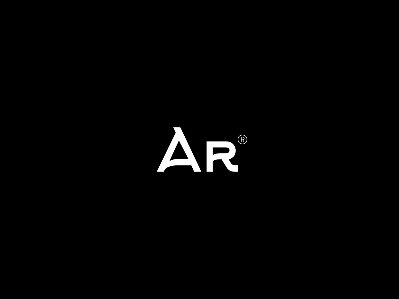
In addition to the wordmark, we’ve crafted a minimalist symbol featuring the initials “AR,” symbolizing the foundation upon which ARCHITECTO builds its vision. This symbol not only exudes a sense of unity and strength but also evokes the timeless allure of architectural design.
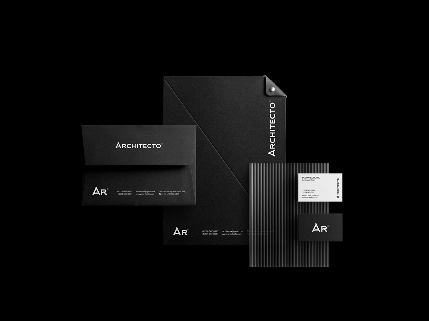
But our journey doesn’t end there. We’ve extended ARCHITECTO’s brand identity to include meticulously designed envelopes, files, and business cards. Each element showcases the same attention to detail and commitment to quality, ensuring that every interaction with ARCHITECTO leaves a lasting impression of professionalism and sophistication.
Join us as we explore the boundless possibilities of space and structure, shaping a brand identity that speaks volumes about ARCHITECTO’s commitment to innovation and craftsmanship. Let’s redefine the skyline together, one masterpiece at a time.
Client: ARCHITECTO | Service: Visual Identity | Designed by: Maisha Sultana
For inquiries:
Mail: logo.maisha@gmail.com, Whatsapp: +8801797623803